A Five-Point Checklist for Schroders
Contents
The following is a comprehensive audit for Schroders.
(If you want an audit for your own hedge fund, contact Damon here.)
Who Is Schroders?
Schroders is a centuries-old asset management company with financial products of several types. I became interested in Schroders when looking into hedge funds focused on the UK market (an interest that itself came as a result of the recent news of Scotland choosing to stay in the UK – most probably a good choice). Schroders offers a hedge fund focused on investing in small and mid-sized companies in the United Kingdom- the UK Dynamic Absolute Return Fund.
Launched in February 2014, the Schroders UK Dynamic Absolute Return Fund manages over 100 million pounds and has an annual return of -9% (this will likely change in the future).
Why Audit Schroders?
Managing over $4 billion in assets, Schroders is a huge company that is unlikely to need my help. Yet I found myself insanely frustrated with their site design and accessibility. Imagining I wanted to invest in their UK Absolute Return Fund, I went to their site, attempting to obtain data on the fund. That’s when the problems became evident.
In this audit, my goal is not to badmouth Schroders. On the contrary, I believe they’re a strong, successful financial management company. But their expertise is clearly fund management, not marketing. Hence, this article is an attempt to help them fix their most apparent mistakes, hopefully attracting more investors.
Disclaimer
I am not affiliated with nor a client of Schroders. I was not commissioned to write this audit. All the data in this article regarding Schroders was obtained from publicly available sources – I was not supplied with any internal data from Schroders itself.
I am writing for both Schroders and other hedge funds who wish to find better ways to market their products.
If you have any questions regarding this disclaimer, please contact me.
Targeting
Most hedge fund websites target the same group of people. Just running a hedge fund’s website through an analytics program will show this to be true. I just tried for Schroders.com and confirmed this to be true. Generally, a hedge fund’s website visitors are:
- Male
- Old (relatively, at least)
- Wealthy
- Browsing from work
Being so, you would expect more hedge funds to integrate these facts into their online marketing. For example, as for Schroders, their site is not at all optimized for older web users. The older generation works better with simple websites that have large fonts, the opposite of what the current Schroders site is like. At the same time, wealthy visitors and people browsing for work are unlikely to spend large amounts of time searching around for the information they want. They tend to be more impatient and more likely to give up (or pass the job to an employee). Thus, Schroders should simplify their menus and layout to allow web users to get to their destinations more quickly.
An analysis of Schroder’s visitors shows that the average visitor leaves the site after viewing only two pages. This is an important statistic, because most of the important pieces of information (the real marketing materials and explanations of their products) are not accessible after only two clicks. For example, from the home page to the page I was looking for – the page describing the UK Absolute Return Fund – I had to go through a total of six clicks – and that’s not counting all the clicks I spent searching and back-tracking.
If someone who does online marketing for a living can’t find what I need without clicking nearly 10 times, how is an older, time-pressed, wealthy investor supposed to find the information he wants? And more importantly, if the average visitor only visits two pages before giving up, what should Schroders do?
Consistency
One thing you’ll notice about Schroder’s site is that, no matter where you go, it eventually forces you to choose a country (and apparently, following Scotland and the UK’s lead, the Middle East has united to become a single country):

This is a good system. Whereas many other sites simply do a cross-website language switch, Schroders actually rewrites the site for each country. Of course, you need writers for the content in each country instead of a general translation, simply due to the fact that writing styles vary across countries.
Tip: Offering your site in different languages not only allows you more international investors but also helps your SEO efforts, letting your site appear higher in the search rankings.
Each country’s website is significantly different from that of the global site and other countries’ sites. This seems like a good idea. However, this system fails in two large respects: the psychology of marketing and cultural design biases.
First, let’s discuss the psychology of marketing. Schroders clearly handed their control over to individual country branches, letting each branch decide how to change the website. This is a mistake because it assumes that investor psychology is radically different across the world. While it may be true that investors in Asia are more conservative than the risk-hungry Americans, people of different cultures are not different to the extent that they will be swayed differently by different website designs. If your system works, it should work across the world, with only small adjustments for psychological biases in different cultures.
The fact that every single website is radically different, even across the same languages (e.g., China vs. Taiwan; Hong Kong vs. the UK) means that Schroders had not set up an all-encompassing online marketing campaign. What’s more, this implies that Schroders hasn’t tested different website designs for conversions; if they did, they would stick with one design – the design with the highest success rates. Instead, the strategy is to give full control to the local branches, hoping that they know better than the main branch – a mistake.
The second mistake you make when you give over control to local branches comes from their local design biases. Everyone has a tendency to look at the websites of competitors and more-or-less mimic those sites. I’ve worked with companies around the world and know most of these design habits. Because I’m fluent in English, Chinese and Japanese, I’ll point out the differences among the US, Chinese, and Japanese sites. But first let me explain their habits:
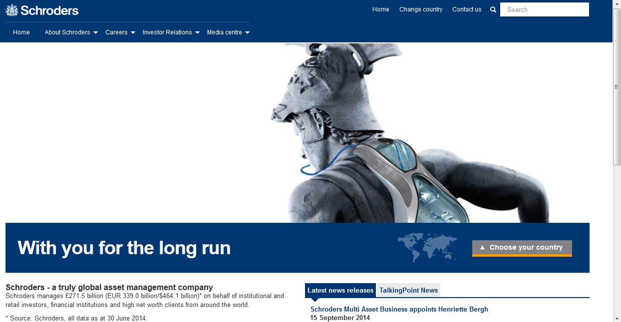
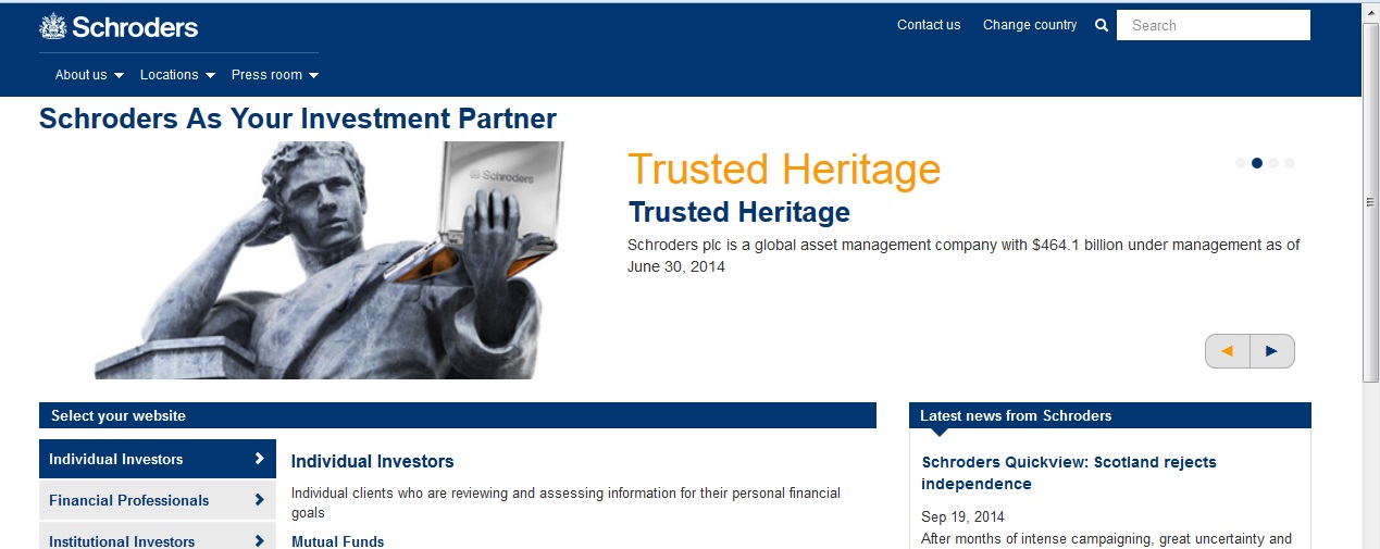
US sites emphasize graphical beauty. Most sites today start with a huge flash banner, which is meant to impress. In fact, it usually decreases conversion rates and increases bounce rates – causing people to leave your site before reading anything else. Let’s see if the US branch of Schroders did this:
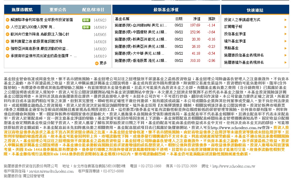
Taiwanese sites act like yellow pages or other ads, in which the designer seems to think we must shove everything we can into this page, using all white space available. Let’s see if the Taiwanese branch of Schroders did this:
Japanese sites are highly minimalist. They cut out what’s not necessary. Their content – the point of a site – is usually put into unorganized lists under vague topic titles, which makes it hard to find what you’re looking for. Let’s see if the Japanese branch of Schroders did this:
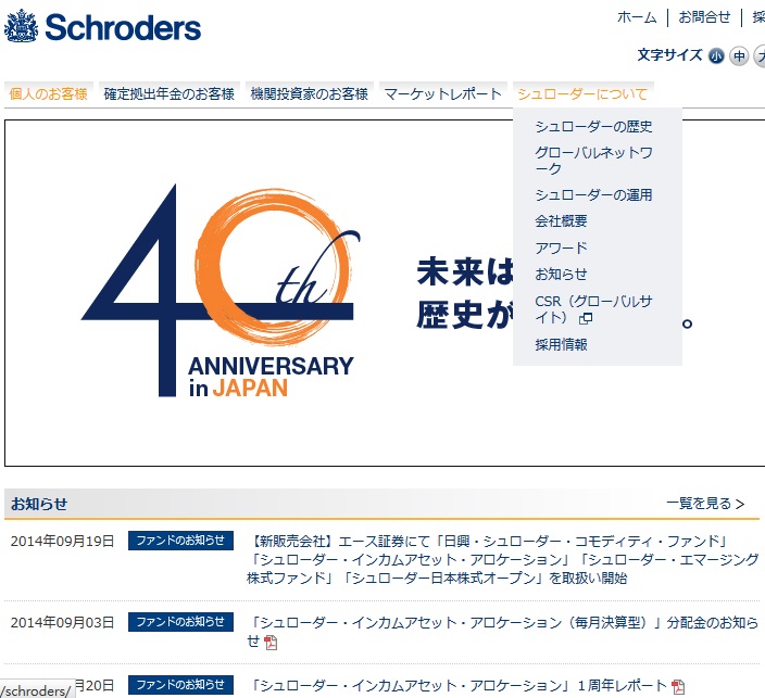
In the above image, the drop-down menu is titled “about Schroders.” The information listed below is under the title “information.”
In fact, the only thing these sites have in common is their relatively high bounce rate: 40% for the US site, 35% for the Japanese site, and 25% for the Taiwanese site. Remember, the bounce rate is the percentage of people who leave your site immediately after getting to the homepage. It’s not random, either. I have worked on sites and gotten their bounce rates down to under 10%. There’s a reason so many people are leaving the website at the home page, so Schroders should definitely look into fixing this issue.
Tip: Use your homepage as a way of funneling traffic to the right places – think of it as a map for your investors, not a place to display your company’s details.
Differentiation
Even big companies need a way to differentiate themselves. Being big is not enough. Schroders has many things going for it but makes none of them apparent. When arriving at the homepage of Schroders you’re greeted with the standard company-centric, investor-ignorant slogans that mean nothing and do nothing to differentiate the company from competitors. Below is a collection of such phrases I found on Schroder’s website, along with reasons for these phrases being useless. These phrases were in positions of prime real estate (i.e., important areas on the site that could have been better used to position Schroders as the right choice for a prospect researching financial instruments).
“Trusted Heritage” – Not at all specific
“Advanced Thinking” – Isn’t all investing “advanced thinking?”
“Your Investment Partner” – Not yet
“Innovative Solutions” – Any fund can say this
“Welcome” (in big orange text taking up the majority of the header) – Come on, this is a website.
To be fair, “Trusted Heritage, Advanced Thinking” seems to be Schroder’s motto. It’s not obvious until you refresh the page a few times to the banner that attaches “advanced” technological wings on a “piece of heritage” along with the banner changes.
Though I might sound harsh, my whole point here is that Schroders is doing what every other big company feels forced to do – say broad, generally good words about oneself in the biggest and loudest way possible.
Tip: Investors are coming to your website for selfish reasons. They don’t care what you think of yourself – all they care about is what you can do for them. Start off by answering these questions.
So what should Schroders do? If I were them, I would comb through the site for such phrases and switch them to specific, investor-centric messages. For example:
- “Trusted Heritage” could become “Over 200 Centuries in Helping Investors Grow Their Wealth”
- “Advanced Thinking” could become “Leverage Our Technologies for Efficient Computer-Based Trading”
- “Your Investment Partner” could become “See What You Get When You Invest with Us.”
- “Innovative Solutions” could become “Investment Strategies from Emerging Market Investment to Statistical Arbitrage”
- “Welcome” could become an easy-to-use map on where to go next (more on this later)
Starting to get it? The key is to switch away from company-centric, general language to investor-centric, specific language.
In addition, Schroders should find a key unique selling proposition (USP) to focus on throughout its site. Its age and experience make good candidates, but Schroders rarely draws upon these themes. Such a USP would allow investors to recognize Schroders and different from competitors. Without a USP, Schroders is just “a big investment company.”
Tip: Find your competitive advantage and flaunt it as your USP.
Traffic
An analysis of Schroders traffic shows that Schroders is relying entirely on its reputation to get website visitors. Through the site gets approximately 2,000 visitors a month, they are almost all coming in from search engines.
This isn’t necessarily a bad thing, as search engine traffic is free. But when nearly all of your search engine traffic is coming from searches on the word “schroders,” it means only people who already know of your fund are visiting your website. In other words, you’re missing out on an opportunity for getting more investors – for attracting people and institutions who aren’t already familiar with your company.
Tip: You can bring in new prospects through Google by writing online content focused on long-tail keywords.
Because Schroders is not running any advertising nor are they running any obvious online marketing campaigns for their hedge fund (I checked), they must be losing some prospects to competitors. These are people who would have investing with Schroders otherwise but simply didn’t have Schroders on their radars when the time to invest came.
Schroders is already a strong, established company. Now it should be focused on growing its reach online, attracting new investors and solidifying its website as a destination for prospects who want to learn more about their investment opportunities. At present, Schroders is relying on reputation and word-of-mouth for the entirety of their online strategy. Obviously, Schroders is successful, but I wonder how much more successful it would be with a stronger online marketing campaign.
Tip: Once you’ve established one aspect of your online business, expand into another aspect – e.g., switch to targeting a new keyword, add a PPC campaign, or begin collecting the emails of prospects leaving your site.
Conclusion
I hope that this audit has been helpful to Schroders and the other hedge funds reading this article. Schroders is an established, successful investment firm that obviously doesn’t need my help. But my area of expertise is not their’s, and visa-versa. Taking my advice to heart could bring them millions of dollars more dollars per year in investments. Remember, your website is an investment, too.
In the future, I would like to see Schroders do the following:
- Simplify the site, better crafting it for its intended audience.
- Get all of the local branches “on the same page” (pun intended) in terms of how to design the local site.
- Test their conversions, and pivot with the results.
- Differentiate their fund to win over prospects who would otherwise go to competitors.
- Run ad campaigns and SEO campaigns targeting keywords that are not “Schroders,” thereby bringing in a new pool of investors.
No Comment