The following is a comprehensive audit for Highland Capital.
(If you want an audit for your own hedge fund, contact Damon here.)
Who Is Highland Capital?
Contents
Highland Capital is an investment advisory firm that controls nearly $20 billion in assets. It’s a rather recent entry into the hedge fund industry (though that’s hard to say now that we have thousands of start-ups per year). Highland Capital’s hedge funds are stated to focus on “low cost,” a strange USP considering the minimum investment for their Highland Capital Management Institutional Fund LLC is a quarter million dollars.
Highland Capital is multinational having offices in Korea, Singapore, and the United States.
Their hedge fund has a total return of 15% and a yearly return of 7.5%.
Why Audit Highland Capital?
The same reason I audit any other hedge fund’s online marketing efforts: to assist them in improving their investor-generating efforts. I chose Highland Capital in particular because of their well-designed website that acts more as a business card than a marketing tool.
Disclaimer
I am not affiliated with nor a client of Highland Capital. I was not commissioned to write this audit. All the data in this article regarding Highland Capital was obtained from publicly available sources – I was not supplied with any internal data from Highland Capital itself.
I am writing for both Highland Capital and other hedge funds who wish to find better ways to market their products.
If you have any questions regarding this disclaimer, please contact me.
Okay…
So there’s lots to talk about here, but let’s start with probably the most important and helpful point (assuming Highland Captial people are reading):
Mistake #1: Ignored Clients
An analysis of Highland Capital’s traffic paints a clear picture of their marketing strategy. Nearly 90% of their online traffic is coming from Google. And the search terms? Here’s the best part. The following search terms make up 90% of Highland Capital’s traffic:
- Highland capital management
- Highland capital
- Highland funds
The implication is clear: Highlands Capital is relying entirely on its brand to gain web traffic. This would imply that they are treating their website as a virtual business card.
To Google: “Where is Highland Capital?”
Google: “Here’s their card.”
A business card does not an investor get.
Tip: Websites designed as business cards might work for plumbers (and rarely, at that), but they certainly don’t help hedge funds get more investors!
Highland Capital does have a significant number of long-tail keywords that are bringing in people who aren’t actively searching for Highland Capital. This is where they could capitalize. But funneling this group of Googlers to specific landing pages that show the benefits of investing with Highland Capital, Highland Capital could easy snatch a few investors out of the hundreds that come in.
But they don’t. Not now, at least.
Nor do they run any advertising. I can imagine their advertising department (should they have one) going through the following discussion:
“Should we run ads?”
“No need: Everyone knows about Highland Capital!”
10 minutes of applause.
If you preach to the choir, only the choir tithes.
Here’s what ought to change in a simple step-by-step:
- Compile a list of the long-tail keywords with the most potential.
- Find the landing pages they are hitting.
- Redesign the landing pages to be cohesive with those long-tail keywords.
Tip: Ensure your search queries and landing pages cooperate.
Mistake #2: Wrong Era
Businesses started creating websites in the 1990s. Those businesses were ahead of the times. Today, a business using 1990s technology is a dinosaur simply because today’s web readers enter websites with different expectations.
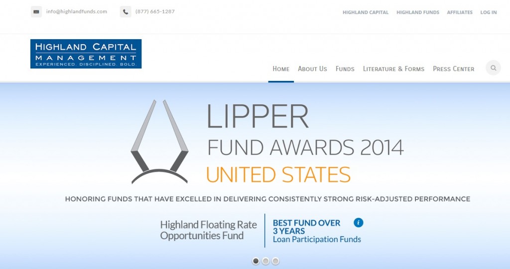
Highland Capital’s website looks great. Professional, sleek, accessible, navigable. They even have a responsive mobile website. Everything looks great on the surface.
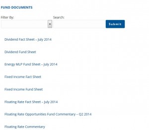
The problem lies in the “funds” and “literature and Forms” section of the website. On these subsections, potential investors can download information on the funds. The problem is that all of these forms are in PDF format.
It always confuses me when I see hedge funds constantly uploading PDF files to their websites as if it’s the best format to transmit information. A PDF file is not even easy to create. You have to write the file as a Doc file (or similar) and then convert it to a PDF. Finally, you have to upload it as a download, which is not immediately accessible on the website. What’s more, mobile users will have to deal with the pain that I myself often go through in having to read a pdf on a tiny smartphone screen.
Tip: Your website’s not done when you say it’s done; it’s done only after you’ve checked it on every browser, tablet, and smartphone.
What’s the advantage of PDF? None really. But hedge funds – nearly every hedge fund – love using them as their information-dissemination machines.
What’s the disadvantage of PDF? Several:
- You lose out on easy SEO efforts.
- You require the reader to go through more effort for the information.
- You make the information unreadable on some computers, tablets, and phones.
- You throw away your ability to easily track or edit how users interact with the information within the PDF.
Highland Capital: Switch out your PDFs to web pages. It’s all public anyway.
Tip: The more accessible you can make the information, the more likely you are to disseminate it.
Mistake #3: Hiring a Web Designer Instead of a Marketer
As I’ve stated before, the website of Highland Capital is sleek and professional. It looks good. But it’s clear that the designer was a web designer, not a marketer or copywriter.
The difference? While the site looks good, it does little to generate leads.
Tip: Unless you’re building a site displaying your art portfolio, hire a copywriter, not a web designer for your web work.
One key giveaway that this site was built by a web designer is its lack of any call to action on any page. A call to action is a phrase, button, or other tool that allows readers to interact with your site in the way intended, such as:
- Registering for a call-in
- Signing up for a newsletter
- Arranging an appointment
Pretty much everything on Highland Capital’s site looks nice, but none of it sells. Here’s how they can change that:
- Put the PDF information behind a door. Only give readers access to that door in exchange for email addresses or phone addresses. This way, in the very least, you can follow up on these prospects and turn a percentage of them into new investors.
- Put a call-to-action at the end of each page. Yes – Every Page! Don’t have your readers have to stop and think of what to do next after reading about your fixed income fund. Have a button or form at the bottom instead, allowing them to request more information or arrange a call-in with a professional.
- Funnel your web content. Instead of mapping it out as an a la carte style website, put the information in a logical order. Send the reader to a profile on the fund manager after he’s read about the fund, for example. Keep the readers moving through your site until you can get them to the call of action you desire.
Again, the site looks great, but Highland Capital can improve greatly in making the site a piece of marketing material rather than a business card.
Tip: The website is not a piece of marketing material; it’s every page on the website that’s a piece of marketing material.
Mistake #4: Writing, Not Copywriting
If Highland Capital is to improve on their website, they will also have to improve on their web-copy as well. At present, it’s highly company-centric, talking mostly, in vague terms, about their history and what they do. But people coming to Highland Capital’s website most likely want to know what Highland Capital can do for them, not what Highland Capital does overall.
It would be a huge project to go through every page of Highland Capital’s website and improve the copy. So instead, I’ll give Highland Capital a large set of guidelines for rewriting their web copy:
- Emphasize your hedge fund’s benefits in the terms your investors will most likely relate to. Consider the sophistication of your investors before you use financial jargon. This will often require some demographic research on your current investors.
- Discover and use the terms that appeal most to your target demographic. Why are they investing? Is it for family? For wealth? For the display of wealth? Figure out which fund corresponds to which type of investor and press the corresponding psychological buttons.
- Most people only read the headline before deciding whether to read the rest of your content. Ensure that all of your headlines highlight a benefit of the fund or service you’re providing.
- Use emotions to excite; use statistics to convince.
- Clarity defeats all. Ensure that your copy is clear, even at the expense of cutting down text or removing clever-sounding marketing phrases. The prospect must know exactly what he’ll be getting when he invests with you.
- Appeal to the idea of exclusivity. For hedge funds, this means presenting the investors as a group of privileged individuals – people who know some secrets about the market that the average investor doesn’t know.
- Add urgency. Your hedge fund might be around for decades, but the market conditions change every day. Emphasize why the current market supports the decision to invest in your fund. Draw on trends, news events, and data.
- Integrate good design practices into your landing pages to support the copy. Ensure that your readers’ eyes follow the path you’ve designed.
- Test. Use Google Analytics to test different aspects of your webpages to see which perform the best. Keep the best performers and improve on the weaklings.
Conclusion
The above tips should bring Highland Capital a long way from the business-card website to a true marketing website. If this audit has been to you, please let me know by contacting me here.


No Comment